

Pinterest’s 2026 Colour Palette (and What It Means for Surface Pattern Designers)

If you’ve felt colour shifting lately, away from soft minimal palettes and towards something richer, louder, and more expressive, you’re not imagining it.
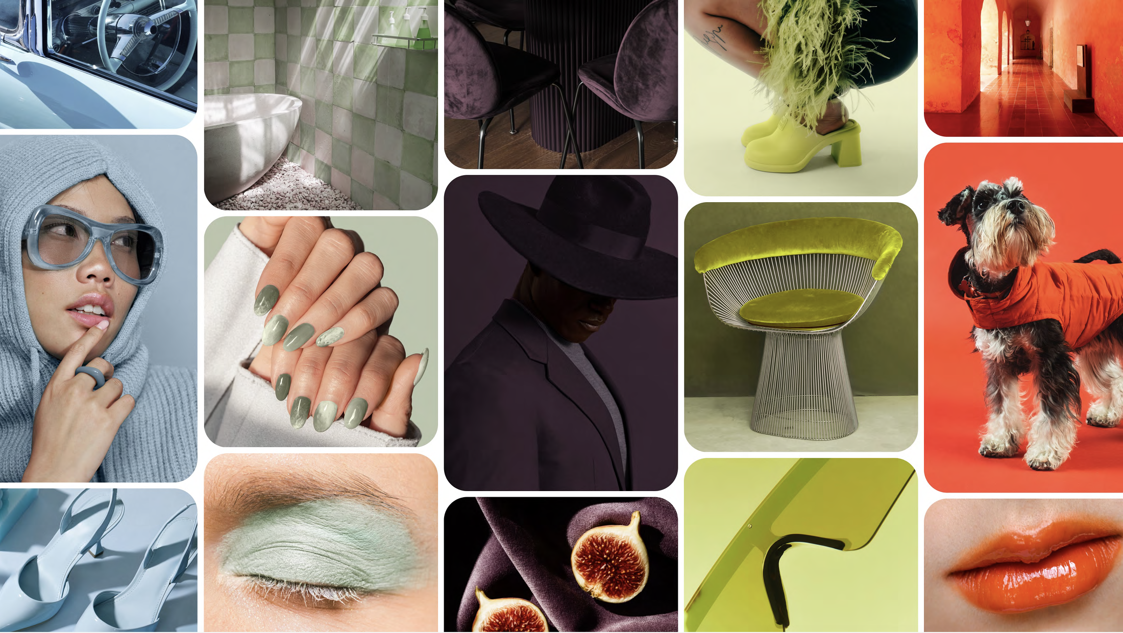
Pinterest’s 2026 colour palette reflects a broader move towards maximalism, personality, and emotional colour choices. For surface pattern designers, this isn’t about chasing brights for the sake of it, but about rethinking how colour functions within a collection. Neutrals are changing. Contrast is changing. Even “safe” palettes are getting more interesting.
What I love about this palette is that it offers multiple entry points, whether you’re all-in on colour or prefer a more restrained approach.
Let’s look at how these colours can actually work in pattern collections.
Maximalism Doesn’t Mean Chaos
Maximalism gets a bad reputation for being overwhelming, but in surface design it’s often about confidence, not clutter.
The 2026 palette leans bold, but it’s also very usable. Instead of relying on beige, grey, or off-white as the backbone of a collection, we’re seeing designers swap in colour-rich “new neutrals” and deeper grounding shades.
That shift opens up a lot of creative space, especially if you design for kids, pets, home décor, or playful brands.
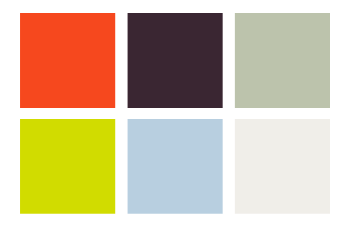
Cool Blue + Jade: The New Neutrals
If bright colour feels intimidating, start here.
Cool blue and jade green are incredibly versatile and work beautifully as base colours within a pattern collection. Think of them as replacements for traditional neutrals rather than statement shades.
Use cool blue as a background colour instead of white or cream
Let jade function like a soft green-leaning neutral that still feels fresh and modern
Build tonal patterns where the colour does most of the work, not the motif
These shades are especially useful for collections that need to appeal broadly, fabric buyers, licensing clients, or products designed to live in real homes.
They calm a palette down without draining it of personality.
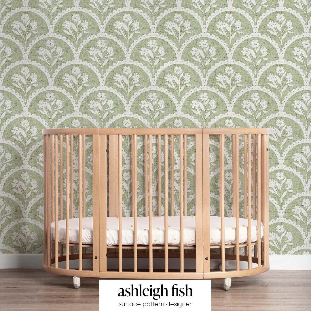
Lacy Daisy in Jade green
Jade green works as a lovely modern neutral in this sweet nursery scene.
Plum Noir: A Better Dark
Dark grey has had a very long run. Plum noir feels like a natural evolution.
For surface pattern designers, this shade is perfect when you need depth or contrast without going fully black. It works beautifully for:
Outlines and linework
Dense background patterns
Secondary colourways within a collection
Plum noir adds richness and warmth, which is especially helpful if you’re pairing it with softer pastels or brighter accent colours. It elevates a collection instantly and feels more intentional than a default dark neutral.
Persimmon + Wasabi: Accent Colours With Energy
These are the colours that bring the fun.
Persimmon is warm, joyful, and expressive, ideal for focal motifs, hero prints, or standout colourways. It plays particularly well with greens and blues, giving collections a balanced warm/cool contrast.
Wasabi is more high-energy and works best in smaller doses unless you’re intentionally going bold. Think:
Tiny detail hits
Unexpected pops in otherwise calm patterns
Accent colourways that give buyers options
Used thoughtfully, these colours can make a collection feel current and playful without overpowering it.
Designing Collections, Not Just Single Prints
What’s most useful about Pinterest’s 2026 palette is how well it supports collection thinking.
Instead of designing one “on-trend” print, consider:
One or two calmer, neutral-leaning colourways (cool blue, jade)
A darker grounding option (plum noir)
One brighter, personality-driven accent (persimmon or wasabi)
This approach makes your work more flexible for licensing, fabric buyers, and retail applications, and it gives your collections a longer shelf life.
Colour Is Getting Braver (Even When It’s Quiet)
Not every designer needs to go full maximalist. But even quieter palettes are becoming more colourful, more expressive, and more intentional.
If you’re not into brights, this is your permission slip to:
Replace beige with blue
Swap grey for plum
Let green act as a neutral
Small shifts like these can completely change how fresh your work feels, without changing your style at all.
Pulled from the Pinterest Palette 2026 PDF - click image to see the full trend report provided by Pinterest