

Pinterest Summer 2026 Trends: A Surface Designer's Guide

Pinterest just dropped their Summer 2026 Trend Report, and the headline trend is... sport.
I know. If you design florals, whimsical illustrations, or soft botanical repeats, your first thought is probably "well, that has nothing to do with me." That was my first thought too.
But here is the thing: you do not read a trend report to copy it. You read it to find the small overlaps with the work you already make, and then you use those overlaps to get seen. So before you scroll past this one, let me show you how a report about jerseys and match-day glam can actually be useful for a surface pattern designer who has never drawn a football in her life.
What is in the Pinterest Summer 2026 Trend Report?
The Pinterest Summer 2026 Trend Report shows sport becoming a whole lifestyle, with team colours, graphic codes, and fan culture shaping fashion, beauty, food, and home, based on data from over 600 million users.
Every season Pinterest looks at what its users are searching, saving, and planning, and turns that into a free trend forecast. Their track record is genuinely good, around 8 in 10 of their past predictions have played out, so this is one of the more useful free resources you have access to as a designer.
This summer the through-line is that sport is not just the game anymore. It is showing up as a way people dress, eat, decorate, and gather. And that is the part that matters for you, because "the visual codes of sport" is a much bigger, more flexible idea than "draw a jersey."
You can read the full Pinterest Summer 2026 Trend Report here. Below is my designer-friendly translation.
Why does a summer trend report matter for surface pattern designers?
Trend reports give surface designers an early, free signal of the colours, motifs, and search terms that buyers and art directors will be drawn to, often months before they peak.
Pinterest sits right at the start of the buying and planning cycle. People go there to plan a wardrobe, a party, a nursery, or a renovation long before they purchase anything. That means the words and looks rising on Pinterest now are often the same ones art directors and product developers will be briefing for later in the year.
So you do not need to follow the report like a rulebook. You just need to spot the one or two threads that overlap with what you already make, and then make sure your work is findable using the words people are already searching.
The rising searches worth paying attention to
Here are the standout search increases from the report. Read them as motifs, palettes, and keywords, not as literal instructions:
female jersey outfit, up 494%
Formula 1 aesthetic outfit, up 483%
denim shorts outfits, up 430%
bandana jewellery, up 303%
Brazil jersey outfit, up 302%
World Cup stickers, up 283%
baddie tracksuit outfit, up 276%
scarves as bag accessories, up 217%
You are not going to design a tracksuit. But look again: bandana, scarf prints, bold team colours, graphic stripes, racing details, denim textures, celebratory stickers. Those are all surface pattern. That is the overlap.
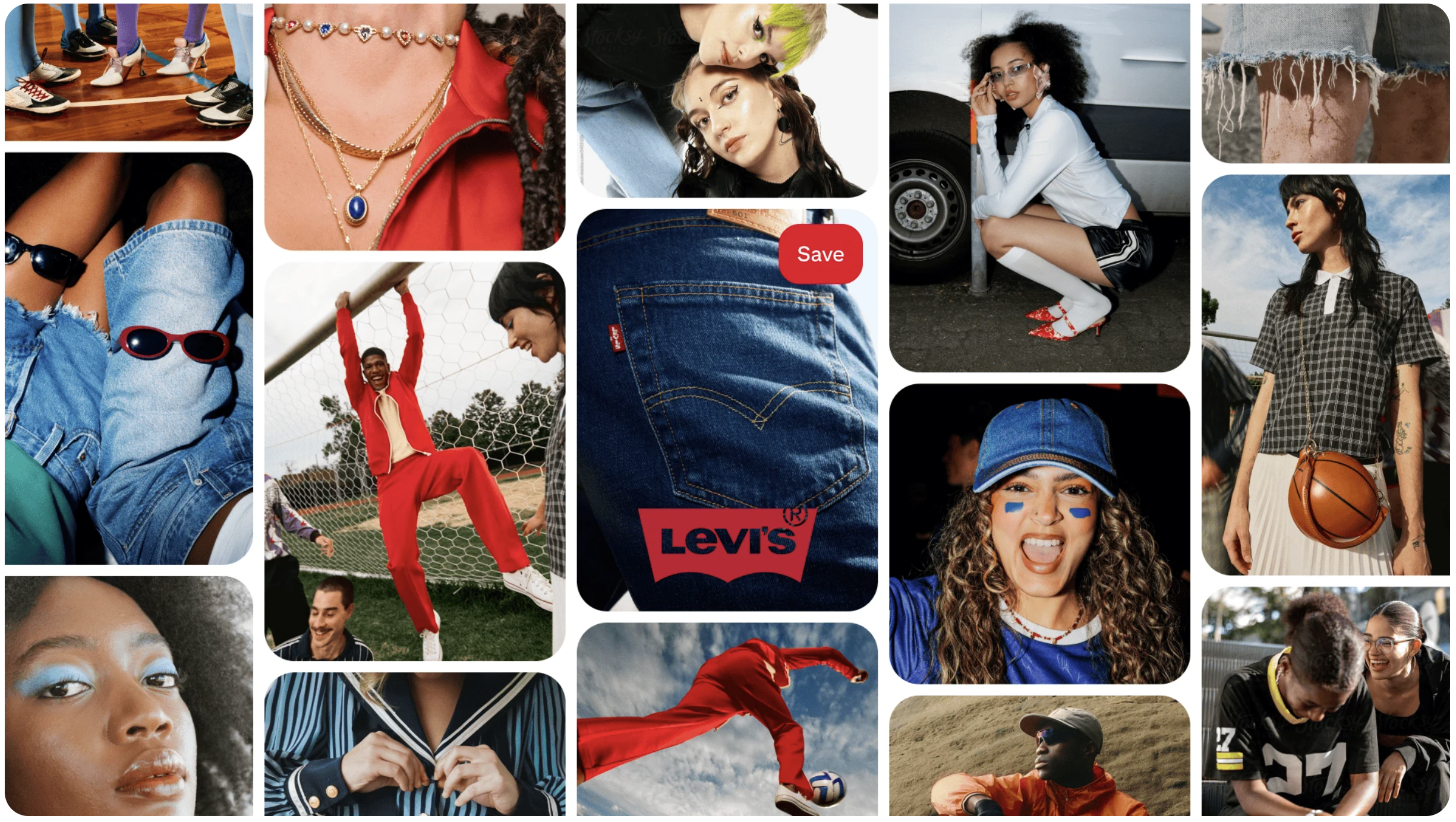
Image from the Pinterest Trend Report page
5 ways to translate the summer 2026 trends into your patterns
Here are the threads I think have the most potential for patterns, illustration, fabric, stationery, and homewares. Pick the ones that already sit close to your style.
1. Bold graphic codes and team colours
Think confident stripes, colour-blocking, varsity and collegiate motifs, numbers and lettering, pennants and flags. This works beautifully for kids, activewear packaging, stationery, and party goods. If you already love a bold geometric repeat, this is your easiest entry point.
2. Bandana and scarf prints
With bandana jewellery and scarves-as-accessories both climbing, paisley, foulard, and silk-scarf-style border prints are having a real moment. These suit fashion, accessories, headwear, and bag designs, and they are a natural fit if your style leans intricate or ornamental.
3. The motorsport edge
Formula 1 styling brings checkered patterns, racing stripes, and a late-90s and early-2000s palette. A little goes a long way here. Even a small checkered border or a racing-stripe accent can make a collection feel current without taking over your whole aesthetic.
4. Sporty off-duty denim
Denim is everywhere in this report. Indigo palettes, topstitch-inspired linework, patch and badge motifs, and worn-in blues all tap into it. This is a lovely, wearable direction for fabric and apparel that does not feel "sporty" at all.
5. Match-day entertaining
The report shows people planning easy, styled, shareable food spreads for watch parties and weekends. That is tabletop and kitchen textile territory: picnic prints, fruit and snack illustrations, gingham, tea towels, napkins, and melamine. If you are a food or botanical illustrator, this is your overlap, no jersey required.
How to use the trend report strategically (without losing your style)
This is the part that matters most, so here is exactly how I would approach it.
Tick the trends that overlap your style
Go through the report and tick only the threads that already sit near what you make. If you design soft florals, the match-day entertaining and bandana threads probably fit, and the motorsport one probably does not. You are looking for overlap, not a personality transplant.
Brainstorm fresh patterns in trending categories
Take one or two threads you ticked and sketch out a small set of 3 to 5 pieces. Keep it light. You are exploring, not committing to a whole new direction. A handful of pieces is plenty to add to your portfolio, upload to Spoonflower, or share on Pinterest.
Optimize your pins with trending keywords
This is the easy win most designers skip. Use the actual rising search terms in your pin titles, descriptions, and board names where they genuinely fit your work. A bandana-inspired floral can use the word "bandana" in the pin. That is how the people already searching these terms find you. You can read more about this in my post on how to use the Pinterest Predicts 2026 report as a surface designer.
Show your work on real products
Trend-led designs land far better when people can see them in context, on a tote, a tea towel, a notebook, a length of fabric. Mockups make that quick, which is exactly what my Magic Mockup Maker is for. A trend-inspired pattern shown on a believable product is far more pinnable than a flat repeat on its own.
You do not need to chase every trend
Let me be really clear about this, because it is where designers get stuck.
You do not need to act on the whole report. You do not need to reinvent your style, abandon what you love, or suddenly become a sportswear designer. Chasing every trend is a fast way to end up with a portfolio that looks like everyone else's and feels like none of yours.
The whole point is to fold a little of what is rising into the work you already make. One thread. One small set of patterns. The right keywords on your pins. That is it. Your style stays yours, and you simply ride a wave of search interest that is already building.
Nothing is missing from your work. It just is not always lined up with what people are searching for in that moment, and a trend report is a free, simple way to close that gap.
Want help getting your designs seen on Pinterest?
If reading this has you thinking "okay, I really need to use Pinterest properly," I have two things that will help.
My free Pinterest guide for surface designers walks you through setting up your account strategically so your art actually gets found.
And my Pinterest Workshop goes deeper into Pinterest SEO, content strategy, and getting your designs in front of art directors and buyers. It pairs really well with this report, because knowing the trends and knowing how to get seen with them is where it all comes together.
Your art deserves to be found. A free trend report is a lovely, low-effort place to start.