

What Art Directors Look for in a Surface Pattern Portfolio
You've spent hours creating patterns you're genuinely proud of, but your portfolio still isn't getting the licensing enquiries you hoped for. Sound familiar?
If you're wondering what art directors are actually looking for when they open your portfolio, you're asking exactly the right question. Because the answer might surprise you: it's not more designs, a more impressive style, or years of experience.
It's clarity.
As a surface pattern designer who has licensed over 100 patterns, I've learned what actually moves the needle, and in this post, I'm breaking down exactly what art directors are scanning for when they review a portfolio. Plus, what small shifts in how you present your work can make the difference between being passed over and getting that licensing conversation started.

If you’ve ever wondered:
“What do art directors actually want to see in a surface pattern portfolio?”
“Why isn’t my portfolio getting licensing enquiries?”
“Do I need more designs before I pitch?”
“What makes a portfolio look professional?”
You’re not alone.
Most surface pattern designers don’t struggle with creativity.
They struggle with clarity.
And art directors are scanning for clarity.
Not volume.
Not perfection.
Not 100 different styles.
Clarity.
Let’s break down what that actually means.
What Do Art Directors Look for in a Surface Pattern Portfolio?
Art directors are busy.
They are reviewing portfolios quickly, often in minutes.
They’re asking themselves:
Can I understand this designer’s style immediately?
Does this work fit our product line?
Do they understand collections?
Would this translate well to product?
They’re not analysing every brushstroke.
They’re looking for signals of professionalism.
And those signals come from structure.
Why Don’t Random Uploads Work for Licensing?
This is where many designers get stuck.
You create:
Florals
Then something modern
Then something whimsical
Then something dark
Then something nursery
Then something boho
All beautiful.
But when placed together with no curation, it looks scattered.
Random uploads don’t show:
Commercial direction
Market awareness
Cohesion
And licensing is about fit.
If an art director can’t instantly see where your work belongs, they move on.
Not because it isn’t good.
But because it isn’t clear.
How Should a Surface Pattern Portfolio Be Structured?
A professional, licensing-ready surface pattern portfolio typically includes:
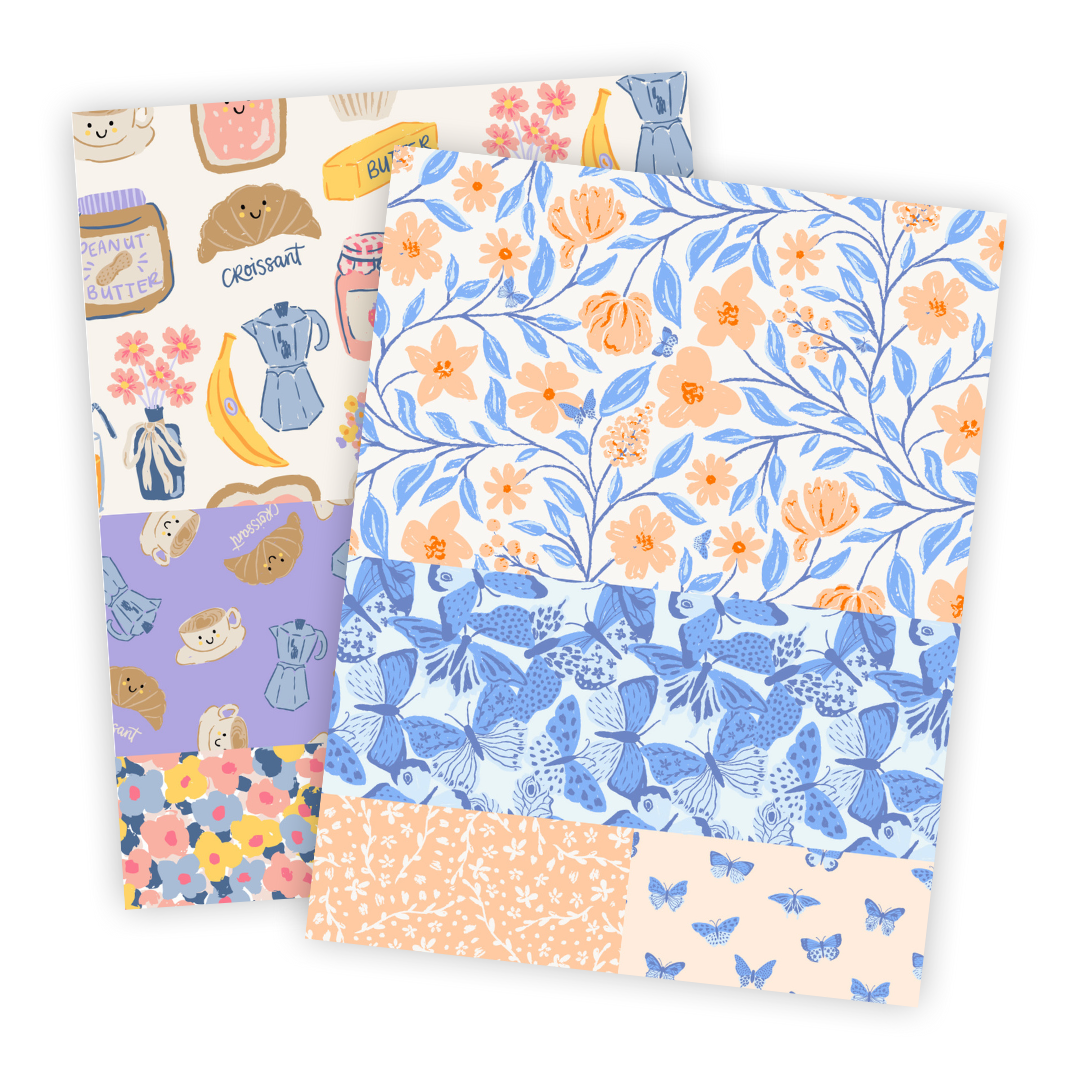
1. Cohesive Collections
Not just single hero patterns.
Collections show:
You understand colour stories
You can build supporting prints
You’re thinking about product ranges
This signals commercial awareness immediately.
2. Clear Market Direction
Are you designing for:
Nursery?
Quilting?
Home décor?
Stationery?
Apparel?
You don’t have to choose one forever.
But your portfolio should make it obvious what industries your designs suit.
Art directors shouldn’t have to guess.
3. Strong Presentation
Presentation doesn’t mean complicated.
It means:
Clear repeat visibility
Clean mockups
No clutter
Easy navigation
Obvious contact information
A portfolio for licensing should feel intentional.
Not like an archive.
4. Editing
This is the uncomfortable one.
Not everything needs to be shown.
A strong portfolio often looks strong because it’s edited.
Art directors don’t need to see every experiment.
They need to see your best, most commercially aligned work.
Do You Need More Designs Before Building Your Portfolio?
Usually? No.
Most designers I work with already have enough work.
What they don’t have is:
A framework for selecting
A structure for organising
A strategy for positioning
So they assume the solution is “make more.”
But often the real solution is:
Refine what’s already there.
What Makes a Surface Pattern Portfolio Look Professional?
Professional portfolios:
Show consistency in style
Include curated collections
Demonstrate commercial thinking
Feel cohesive and intentional
Make licensing availability clear
They don’t look overwhelming.
They don’t look scattered.
They don’t look unsure.
And that confidence?
It comes from clarity.
The Gap Most Designers Don’t Realise They Have
There’s a difference between:
Having good designs
&
Having a licensing-ready portfolio
One is creative output.
The other is strategic presentation.
When you close that gap, everything shifts:
Pitching feels easier
Conversations feel more confident
Your work looks more advanced, without changing your style
I’m teaching how to build your portfolio in my (Free) workshop.

I’m running a free 4-part training on building a licensing-ready surface pattern design portfolio.
Inside the training, I’ll walk you through:
Why structure changes everything
What makes a portfolio commercially strong
How to turn your existing designs into something cohesive
If you’ve been thinking:
“I know I need to fix my portfolio but I don’t know where to start.”
This is for you.
You don’t need more talent.
You don’t need more time.
You need clarity.
And that’s something we can build.

Frequently Asked Questions
How do I know if my surface pattern portfolio is ready for licensing?
Your portfolio is ready for licensing when it clearly shows cohesive collections, commercial awareness, and a consistent style direction. You don’t need dozens of designs, you need curated work that feels intentional. If an art director can immediately understand your aesthetic and the industries your designs suit, you’re likely more ready than you think.
Should I show all my styles in my surface pattern design portfolio?
Not at once.
If your portfolio includes too many unrelated styles, it can feel scattered and unclear. Art directors are looking for cohesion and clarity. It’s often stronger to group your work into defined collections or focus areas rather than displaying every aesthetic you’ve explored.
Do I need mockups in my surface pattern portfolio?
Mockups aren’t mandatory, but they are highly recommended.
Simple, clean mockups help art directors visualise how your patterns translate to product. They also signal professionalism and commercial awareness. The key is to keep them clear and uncluttered so your repeat pattern remains the focus.
Why isn’t my portfolio attracting licensing enquiries?
If your portfolio isn’t attracting licensing enquiries, the issue is usually presentation, not talent. Common reasons include unclear style direction, lack of collections, no defined industry focus, or random uploads without structure. A licensing-ready portfolio makes it easy for art directors to immediately understand your work and how it fits their product line.